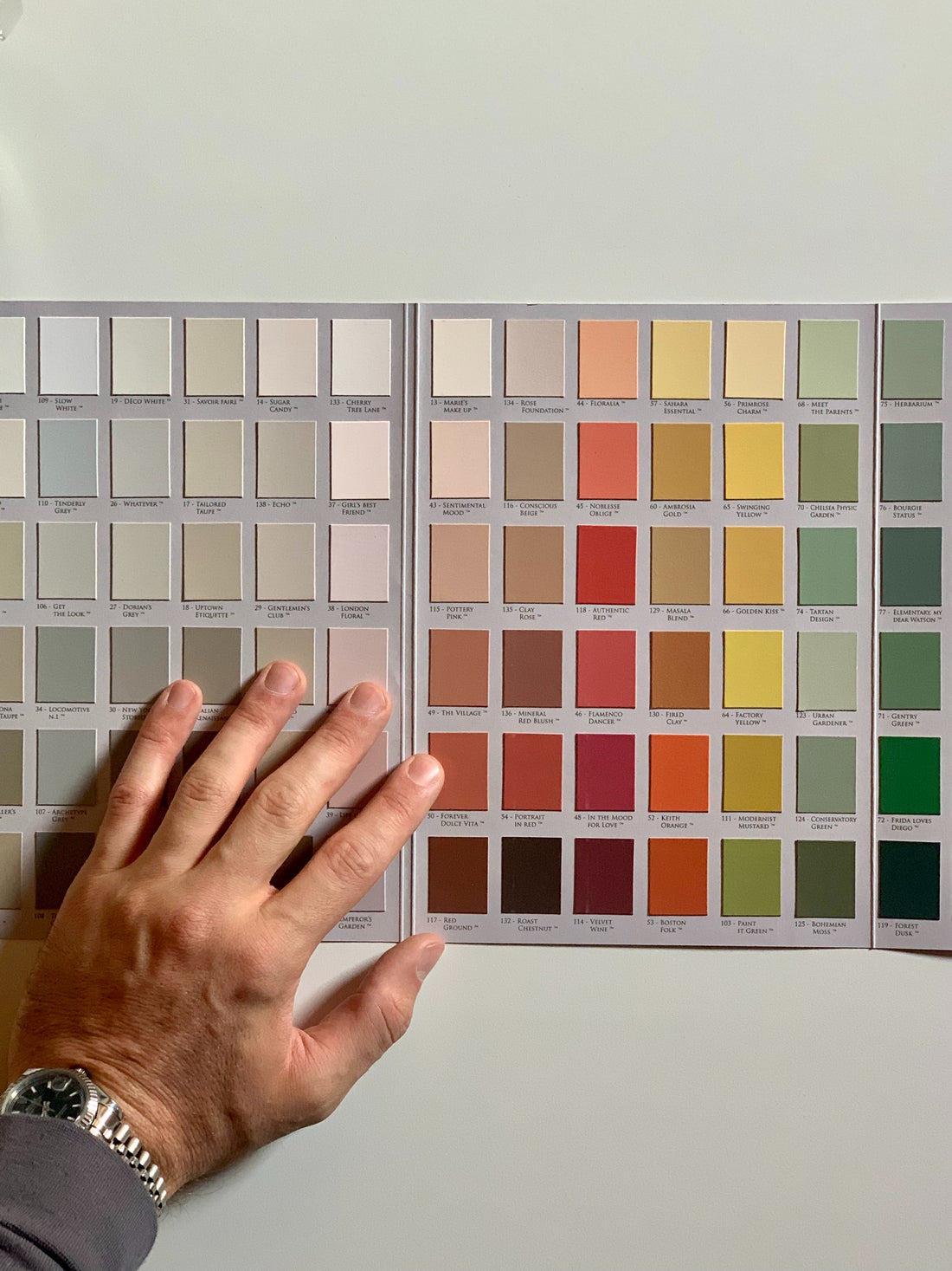
One of the most important aspects of renovating and designing your house is the colour scheme. In this post, we share some useful tips on how you could create an interior colour scheme that works well together.
Let's start by thinking about this question: If you could wear only one shirt for the next 5 years, which of the following would you choose?
1) A shirt in a basic shade such as monotone or earth colours
2) A shirt in the trendiest colour of the year
3) A shirt with a fancy pattern
Chances are, almost all of you would have chosen A -- the shirt in the basic colour -- and the reason being, it is most versatile.

The way to consider your interior colour scheme is the same. Once set, you will have to follow through with this for the next 5 years or more. So the idea is to go for a basic or neutral tone for the infrastructure, such as the tiles, flooring and cabinetry. Then, bring in visual interest through colours and patterns with your soft furnishings, such as furniture, beddings and carpets. It's just like accentuating your neutral tone outfit with colourful accessories. This way, you could easily revamp your interior colour scheme several years down the road without too much trouble by changing the soft furnishings.
Single Colour Doesn't Mean Monotone

People often say, do not use too many colours in your interiors; try to stick to just 2-3. Maybe some of you are thinking -- isn't that quite dull? But actually, using a single colour doesn't mean you use the exact same tone throughout.
For example, if you're using white as your base colour for infrastructure, it doesn't mean you have to use the same white all around. You could use a creamy white, which has a yellow undertone, for the walls, and a full white for the ceiling. You could also use white subway tiles for your kitchen walls. Even though these elements are all white, they are variations of the colour, and would tie in well together while keeping things interesting.
To apply the same thinking on your accent colour, if you've chosen green, it doesn't mean you just use the same shade of green everywhere. You could have a dark moss green accent wall, paired with a rug with apple green details, and indoor plants around the room, which add different pops of green everywhere.
Having high, mid and low tones of each colour will help you to create visual interest in the room effortlessly, without going overboard with the colours.
Here's another useful tip: try not to use your accent colours on big furnitures such as sofas. While a trendy item like a velvet green sofa might have seemed like a good idea this year, you can't be sure if you'll like it 5 years down the road. It would be wiser to choose something more timeless for expensive items such as the sofa. Instead, work in those trendy colours with smaller items which you could just replace once they fall out of favour.
Useful Colour Palette Tools & Hacks
If you've truly no idea where to start, one foolproof method we use is to find a painting we love and create a colour palette from there. Check out what we created with a Matisse painting for inspiration using the 'Match a Photo' function of ColorSnap!


Picture credits: Stefano Manzini / Andrew Neel / Jane Duursma

